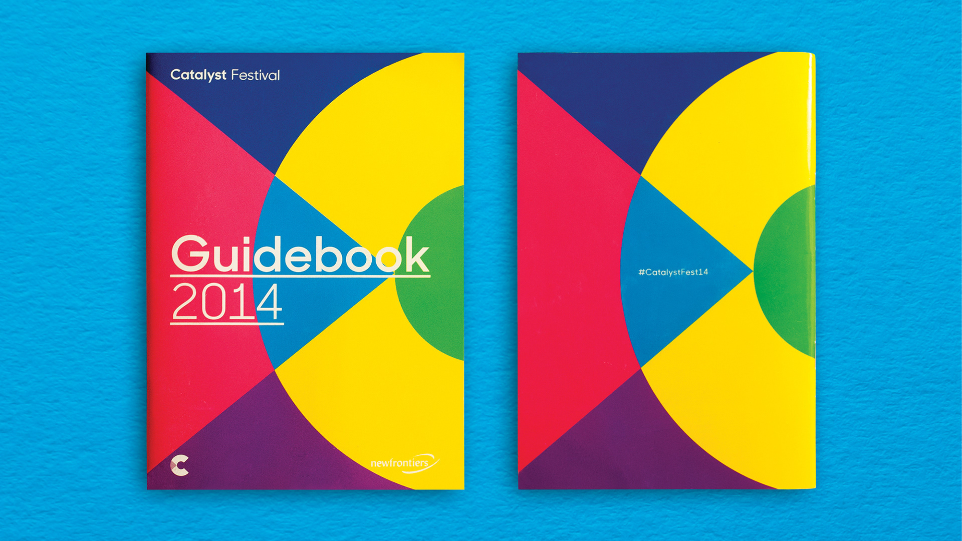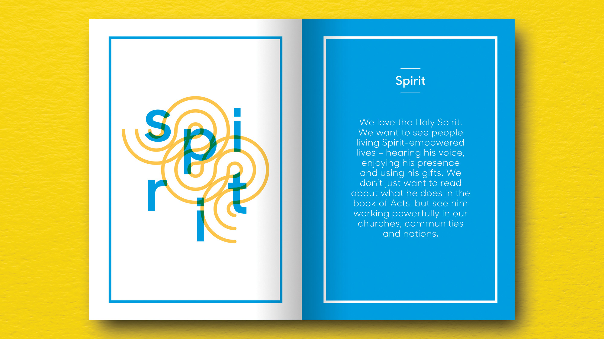
Client details
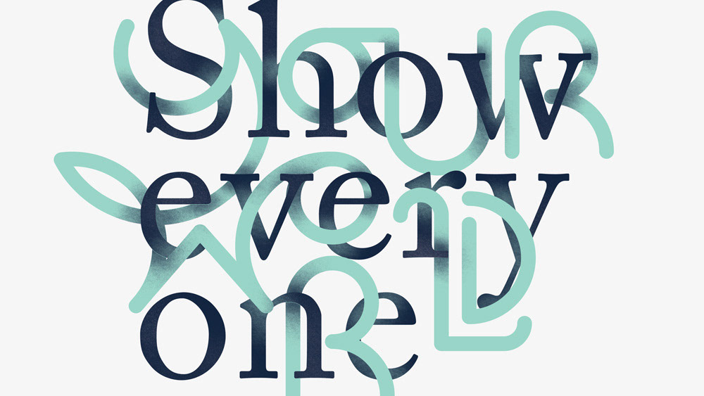
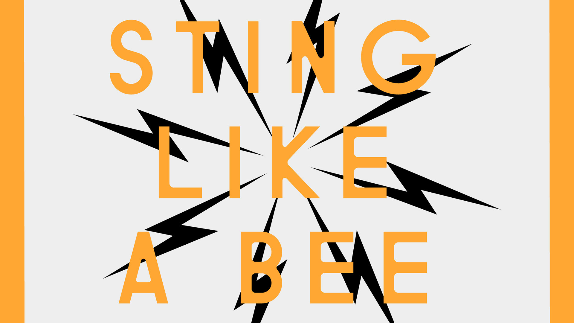
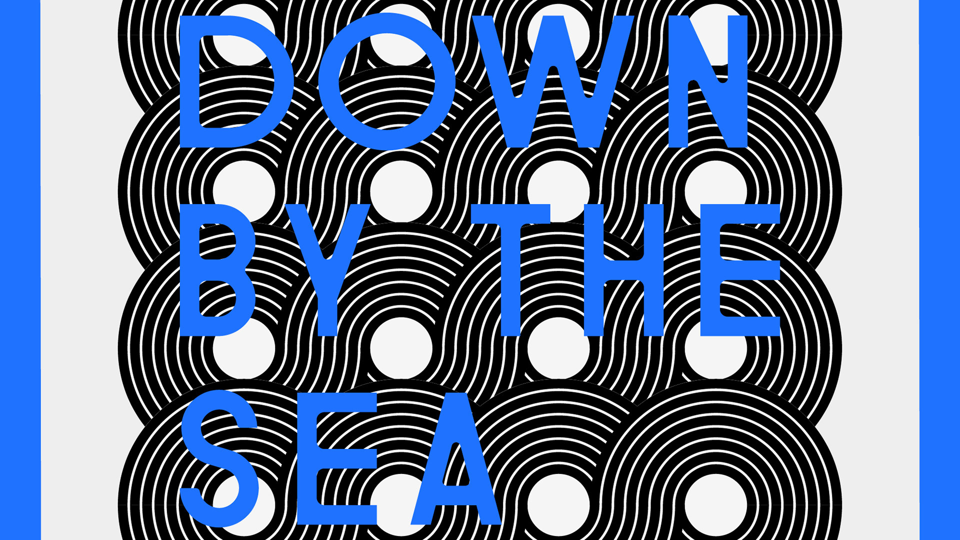
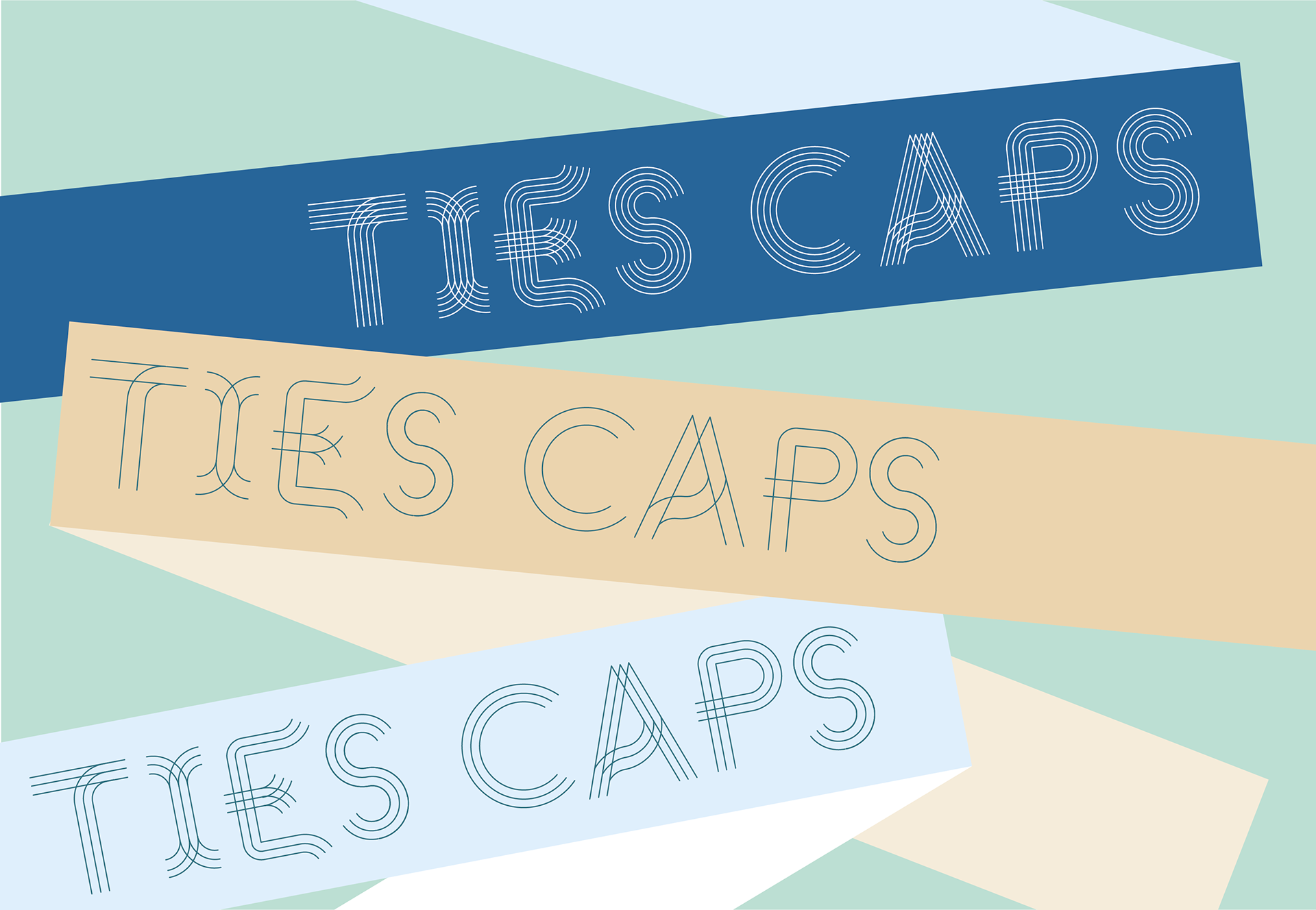
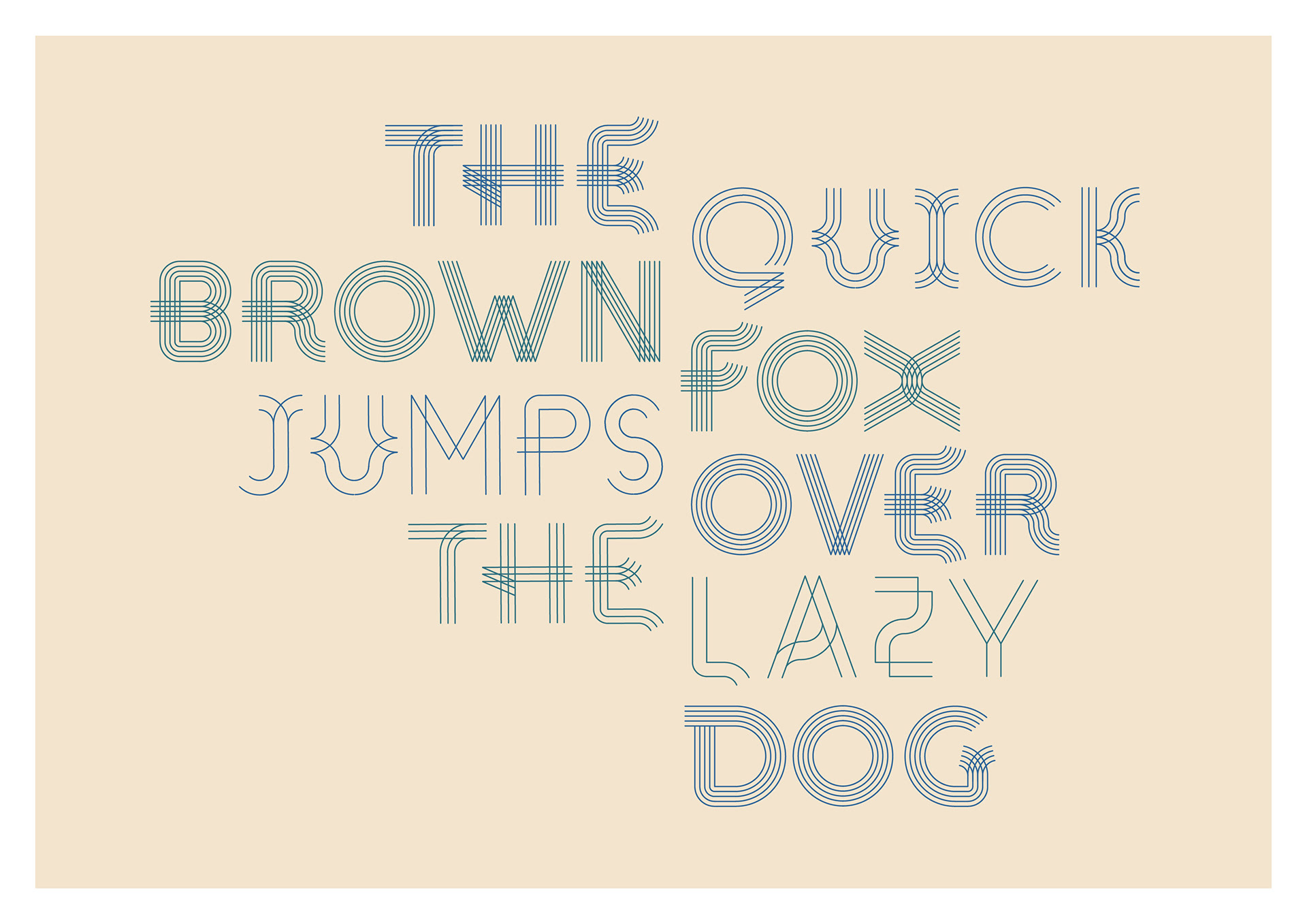
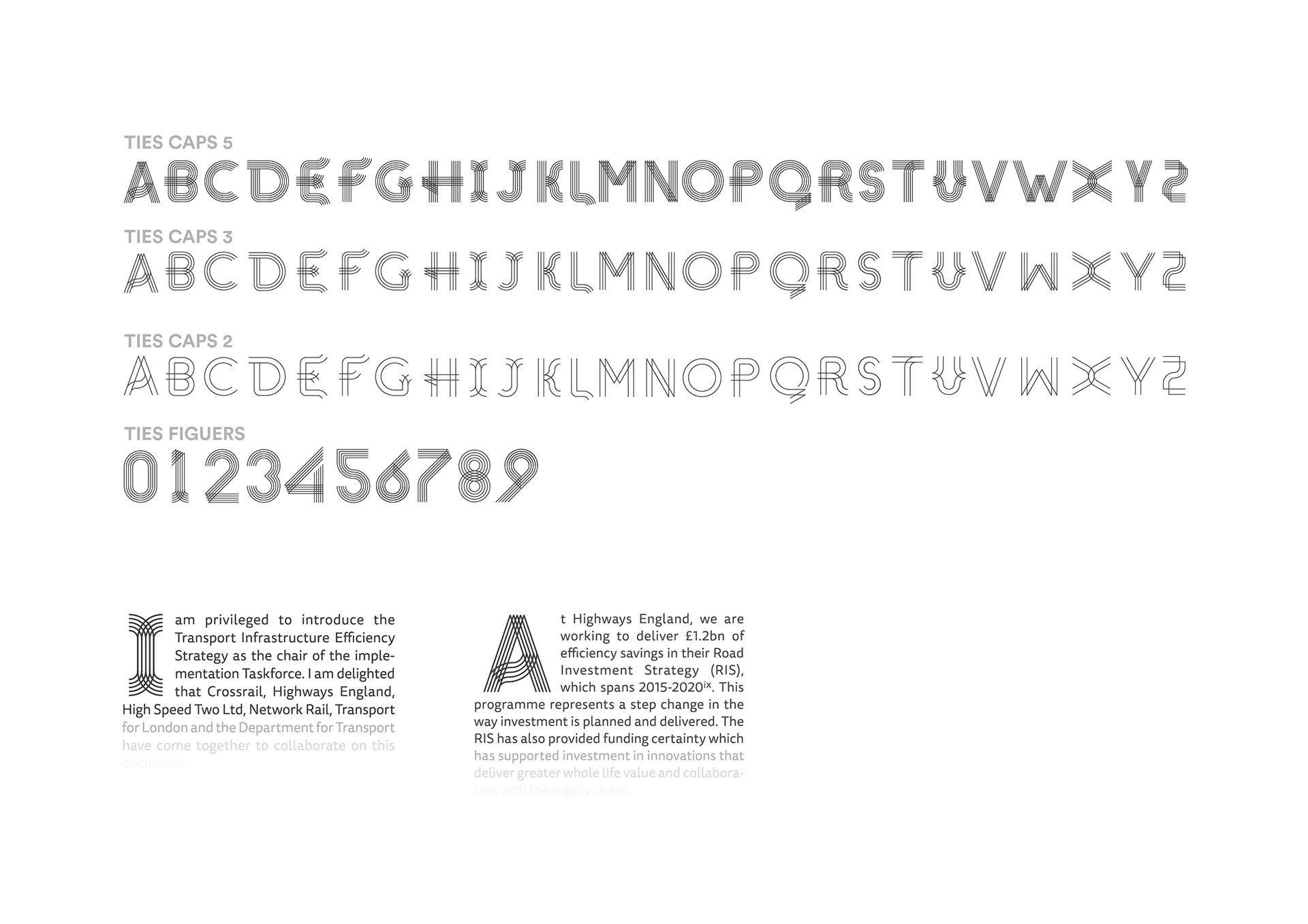
As part of the Transport Infrastructure Efficiency Strategy (TIES), I created a typeface to use for the drop caps and the section breaks. I further developed this into a display typeface containing weights, of 2, 3 and 5 lines.
Process
A contemporary display typeface that draws on abstract ideas of transport, links, roads, movement and connections. Utilising the parallel lines and strong geometric shapes to form the basis of the typeface and interspersing quirks and kinks in to certain characters to create a typeface that works as drop caps and a display header style as well.